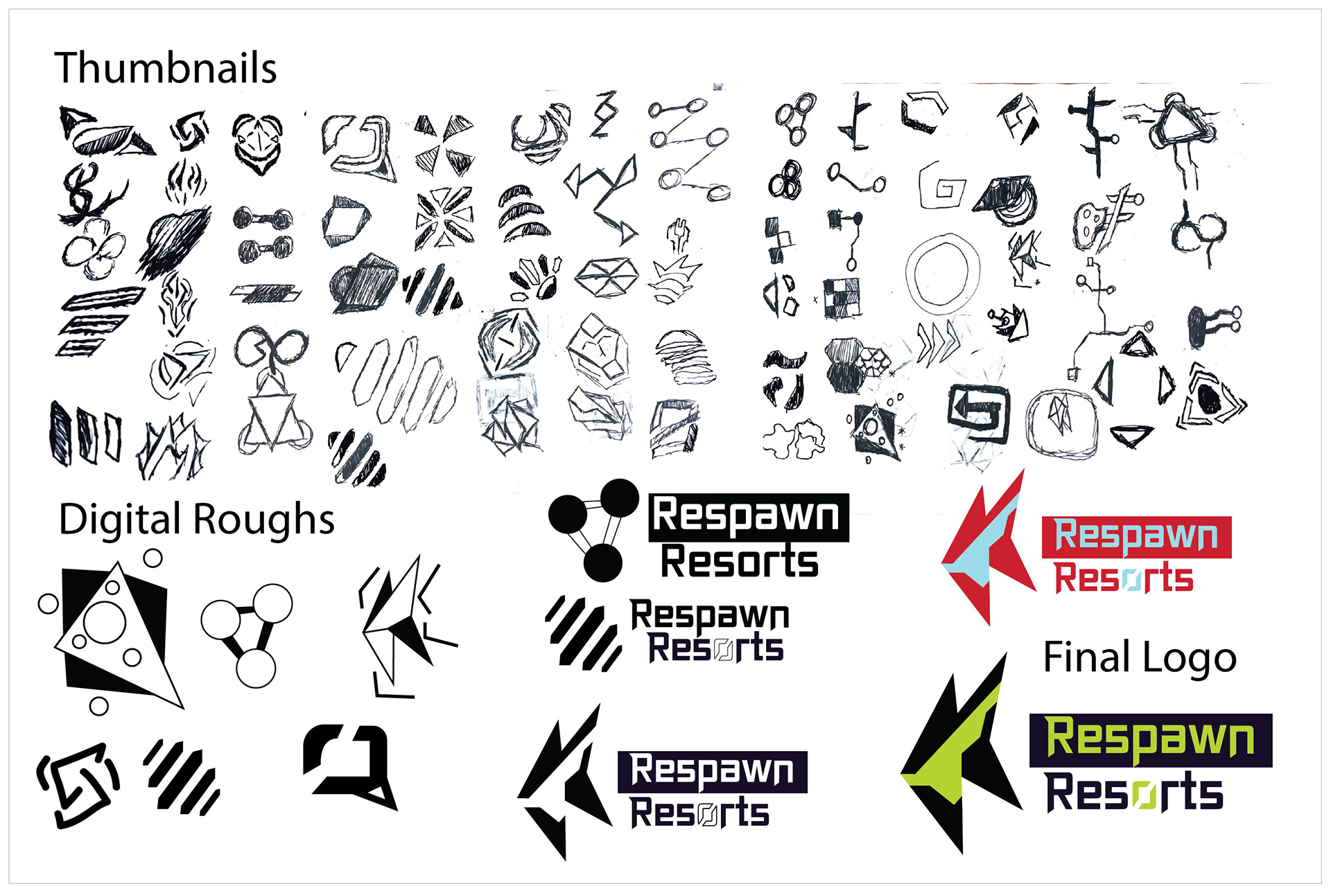
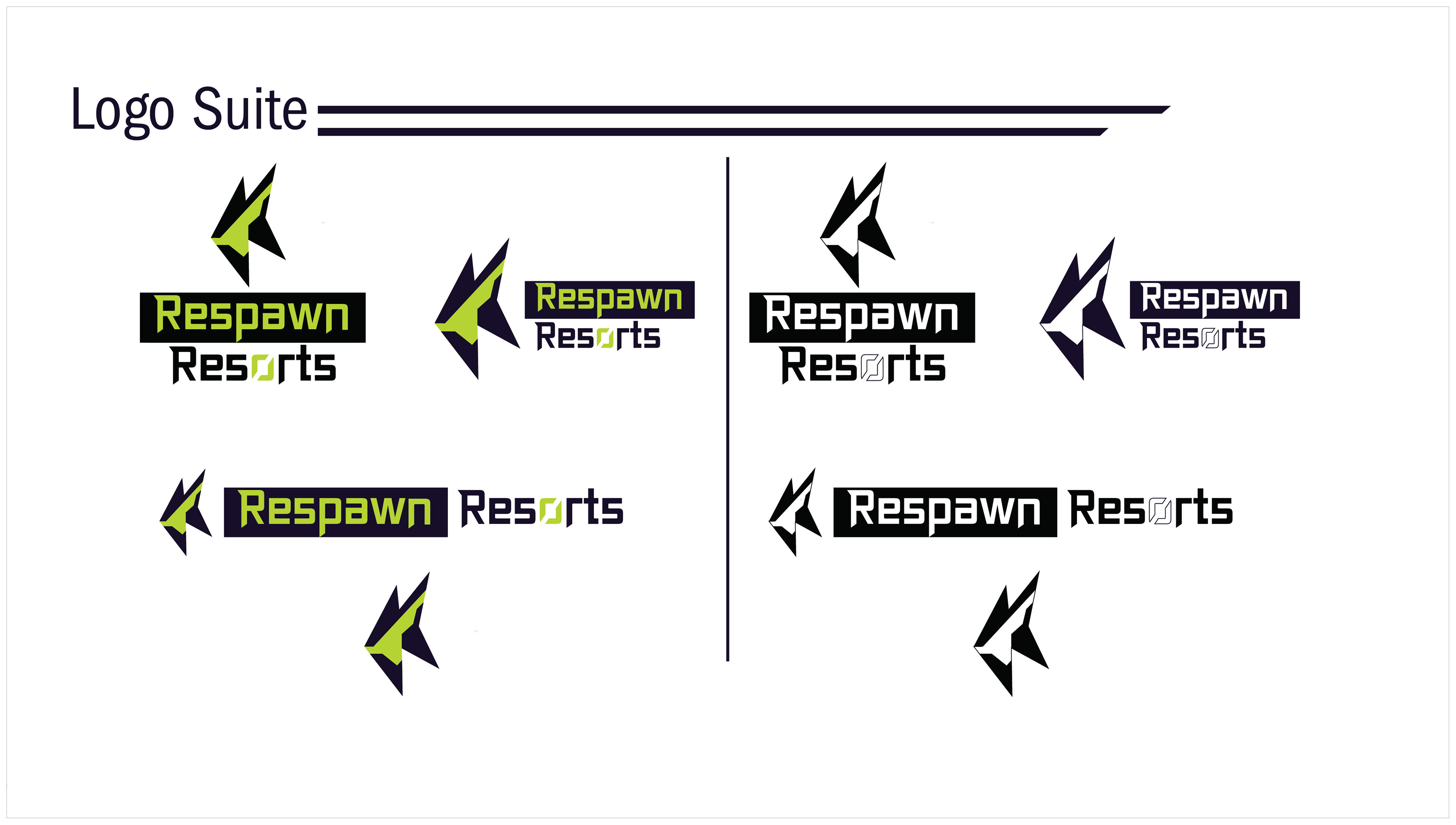
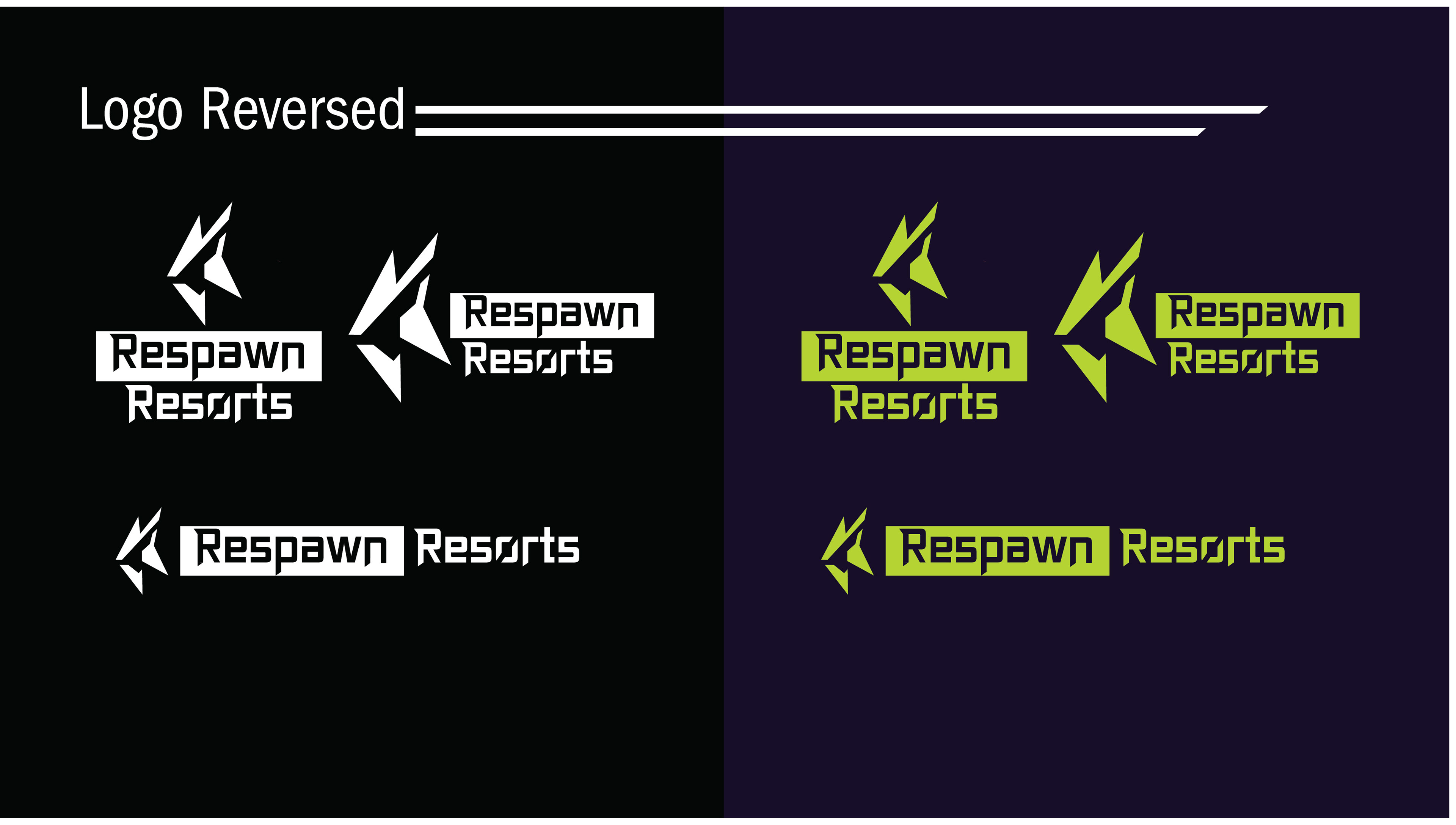
Respawn Resorts, an immersive gaming resort, required a logo that could symbolize the gaming aesthetic while feeling fun and welcoming. Research and sketch exploration investigating various symbols, player interaction, and resort experiences to identify a unique visual direction. An abstract mark with energetic, sharp forms was created to represent connection, immersion, and playfulness while maintaining a clean identity. The result is a memorable brand mark reflecting the resort’s fun environment and immersive guest experience.
Deliverables:
12 x 18in Poster
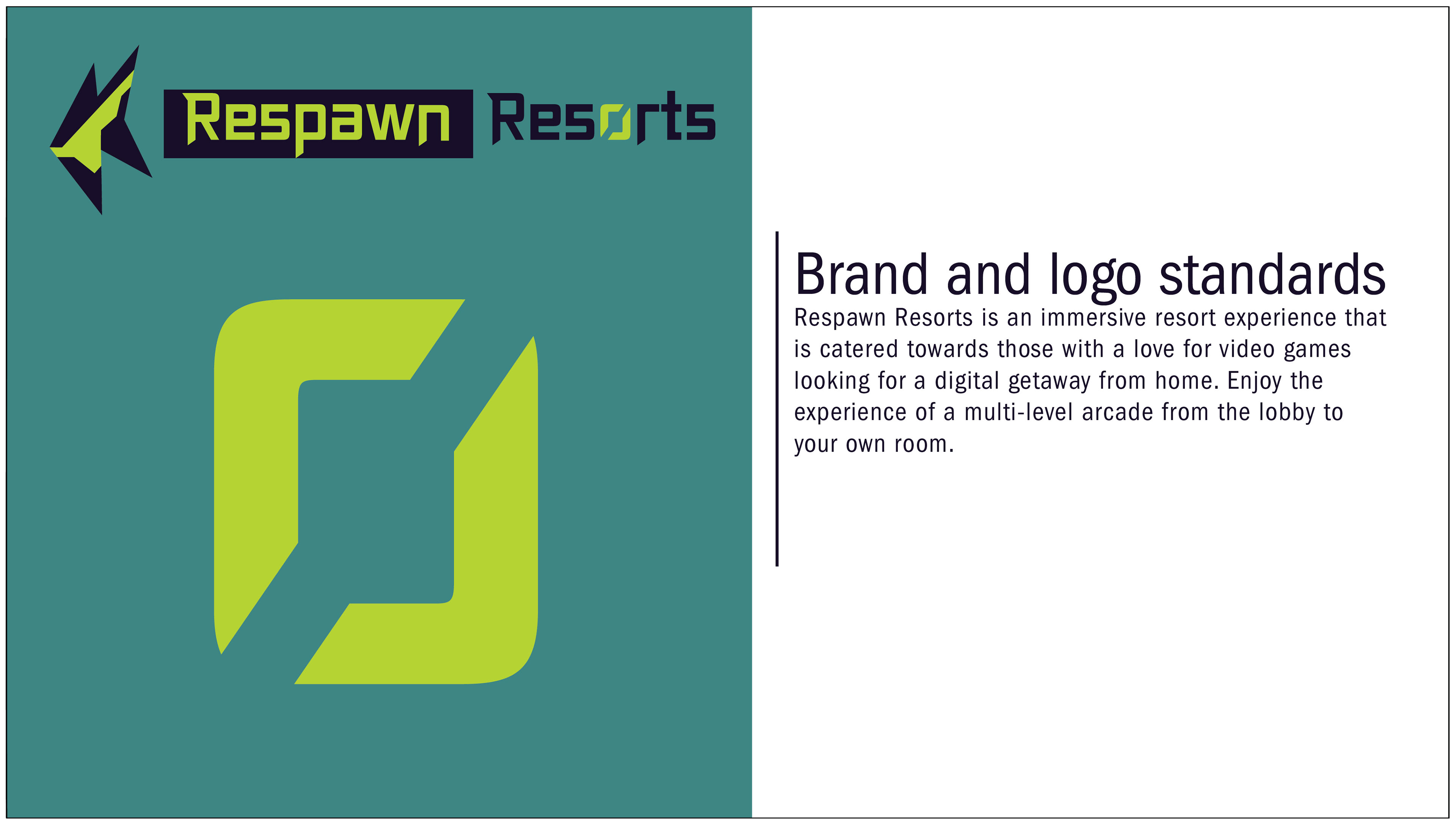
Applying the Respawn Resorts branding to a digital brand deck was a challenge that required a design that was simple and easy to navigate. Utilizing a structured grid and consistent typography allowed the deck to be organized into a digital reference guide that extends the brand’s identity.
Deliverables:
1920 x 1090px Digital deck
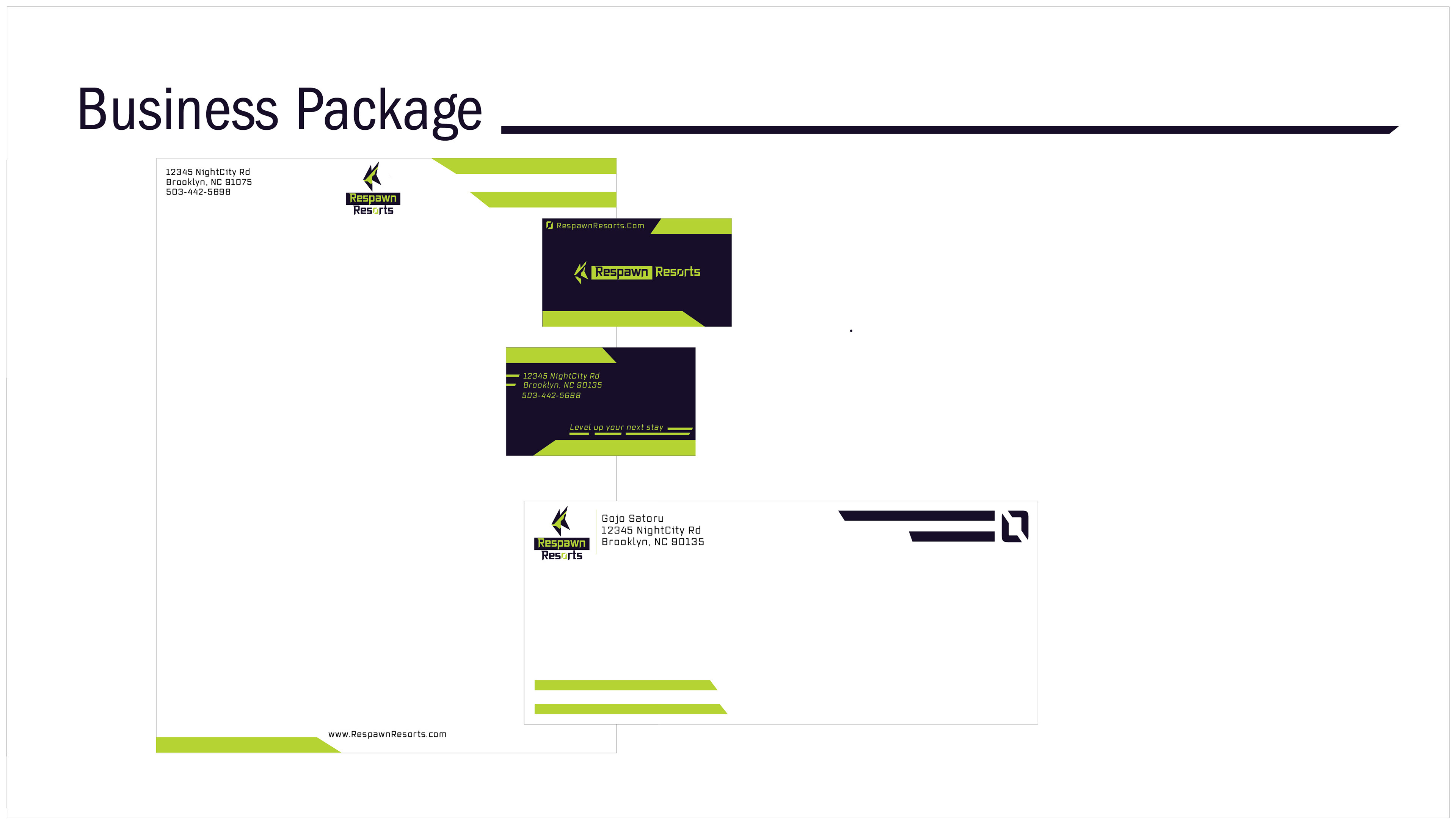
8.5 x 11in Letterhead
3.5 x 2in Business Card
9.5 x 4.5in Envelope
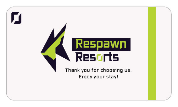
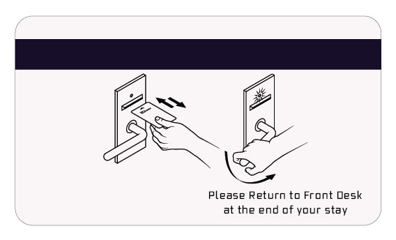
Applying the Respawn Resorts branding to a physical collateral required a simple yet immersive design approach. Decorative elements inspired by video game user interfaces were incorporated throughout to reinforce the brand’s gaming-focused identity. Angular typography and a contrasting color palette were carried across each piece, creating a cohesive brand package.
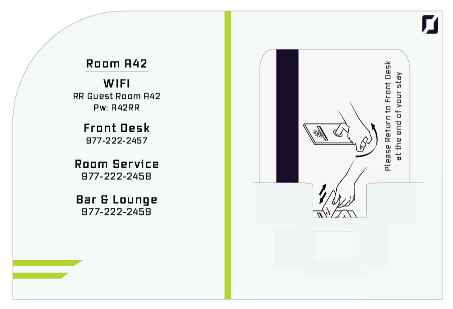
deliverables:
3.375 x 2.125in Keycard
6 x 5in Keycard Holder
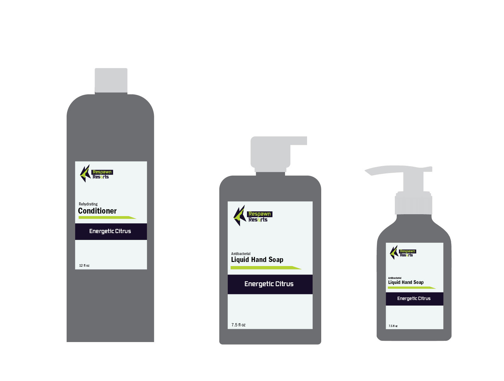
Applying the Respawn Resorts branding to a set of in-room amenities required creating cohesive packaging layouts for items such as soaps and shampoos while maintaining a consistent experience. Angular elements were incorporated into the design to reinforce the resort’s video game-inspired aesthetic and creates visual interest across each product. The result is a set of unified amenities extending the brand’s identity.
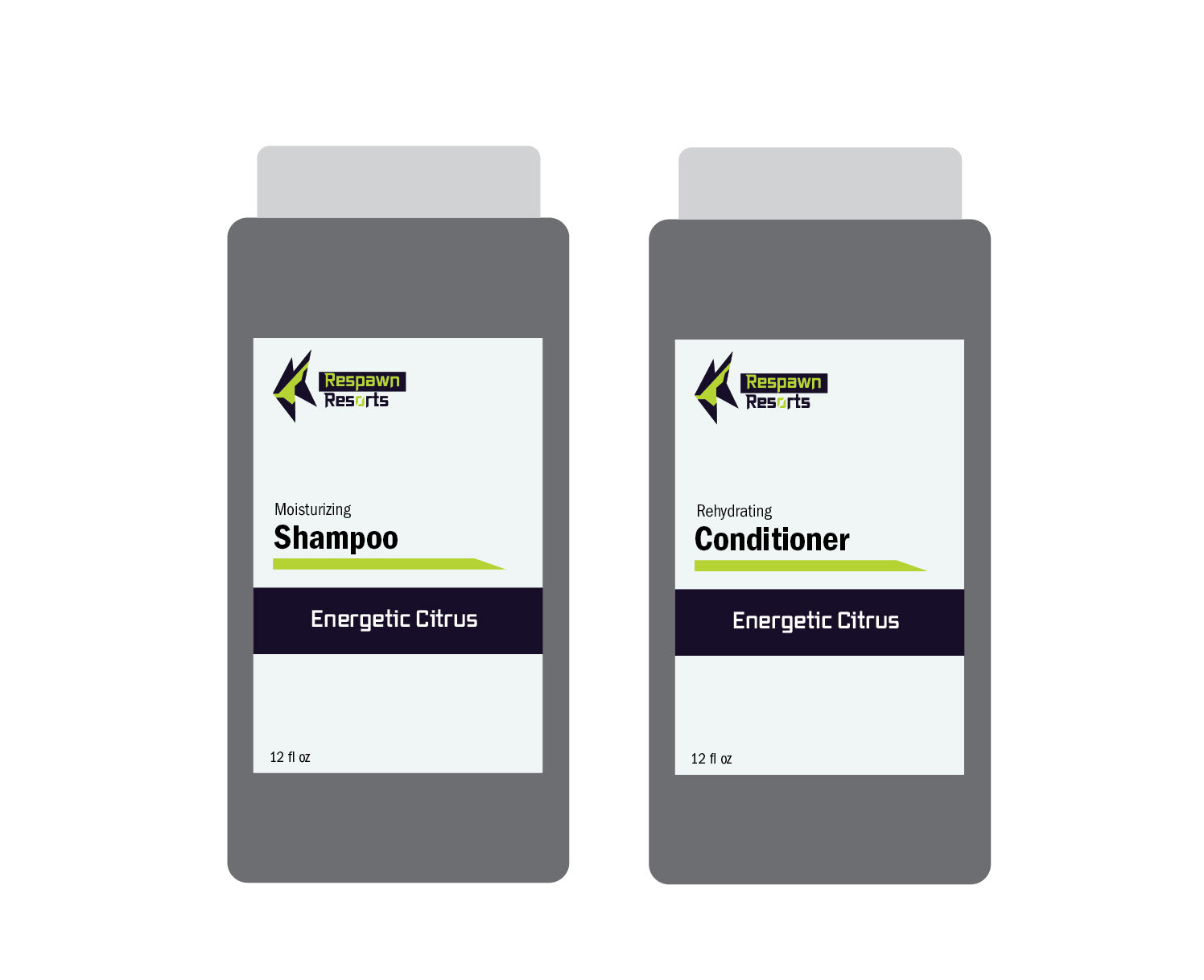
Deliverables:
3 x 4in Shampoo Label
3 x 4in Conditioner Label
2 x 3.5in Hand Soap Label
2.5 x 3.5in Hand Soap Label