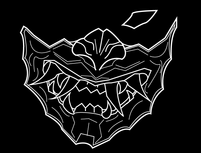
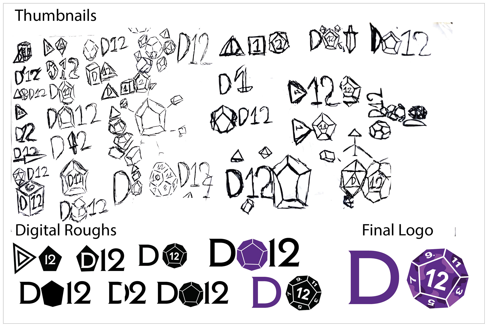
Creating the logo for the D12 brand required multiple iterations of logotypes and dice symbols to capture both the craftsmanship and the excitement of tabletop gaming. Sketch exploration examined dice iconography and fantasy aesthetics. Using the process of resin and acrylic dice making to inform a distinctive visual direction. Iterations of logotypes and dice-based symbols were refined to reflect a sense of magic, mystery, and collectability. The result is a unique brand identity that embodies the immersive and creative spirit of dice enthusiasts while reinforcing the brand’s sense of discovery and excitement.
deliverables:
12 x 18in Poster
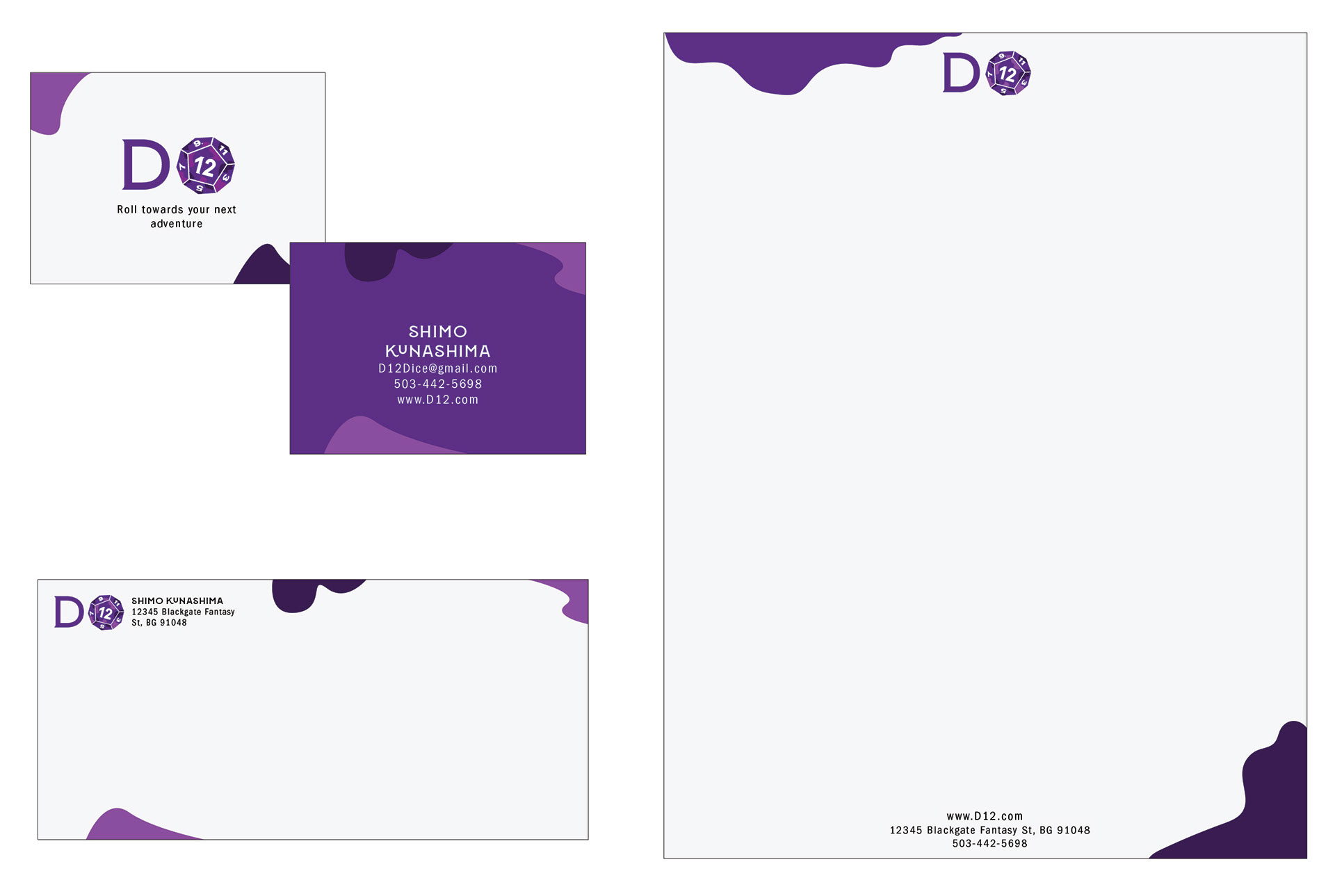
Applying the D12 branding to print collateral required a simple yet playful design approach. Inspired by the process of mixing dyes into acrylic dice, decorative elements were used to create visual interest while reinforcing the brand’s connection to tabletop gaming and maintaining a clean, approachable aesthetic.
deliverables:
8.5 x 11in Letterhead
3.5 x 2in Business Card
9.5 x 4in Envelope
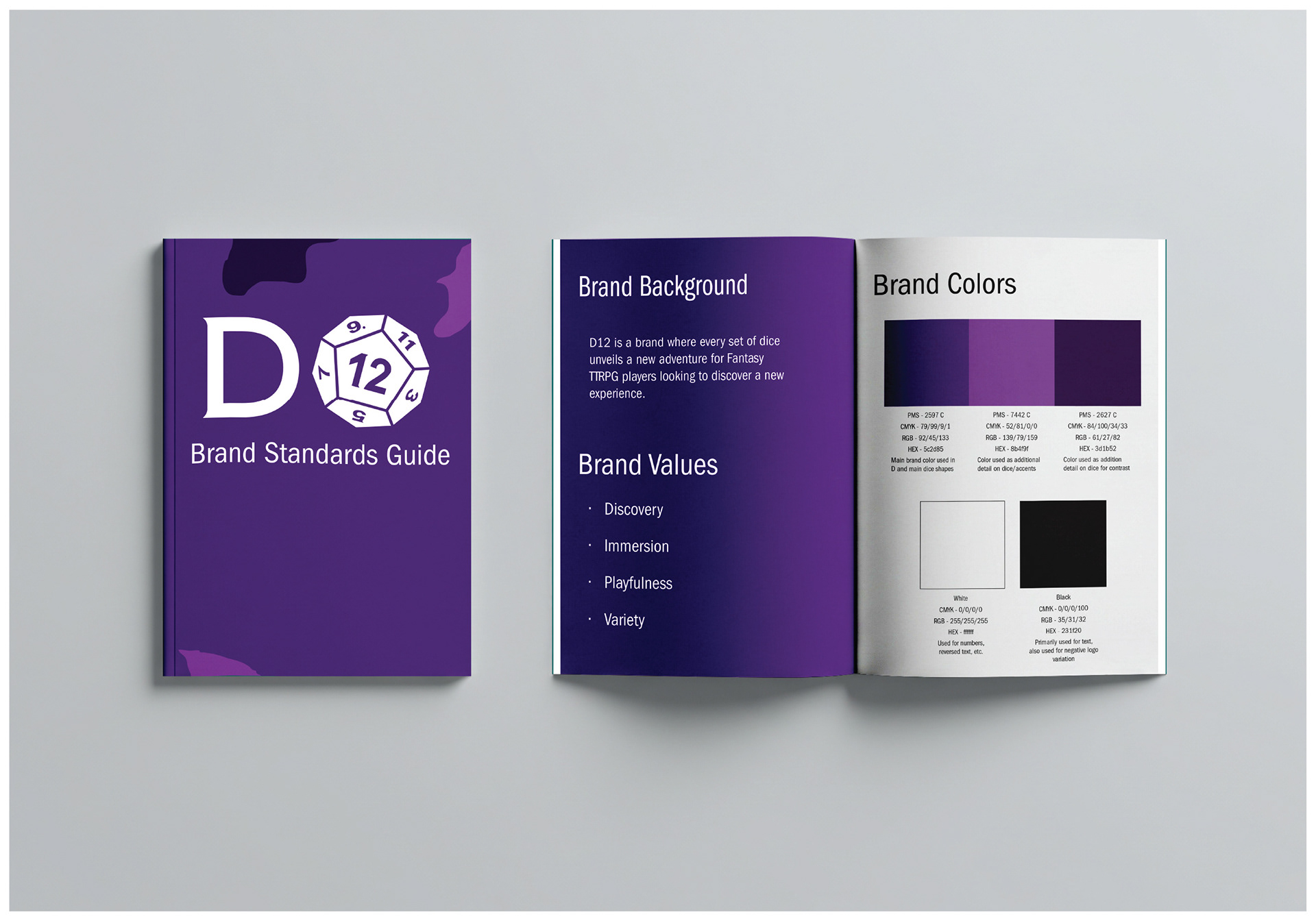
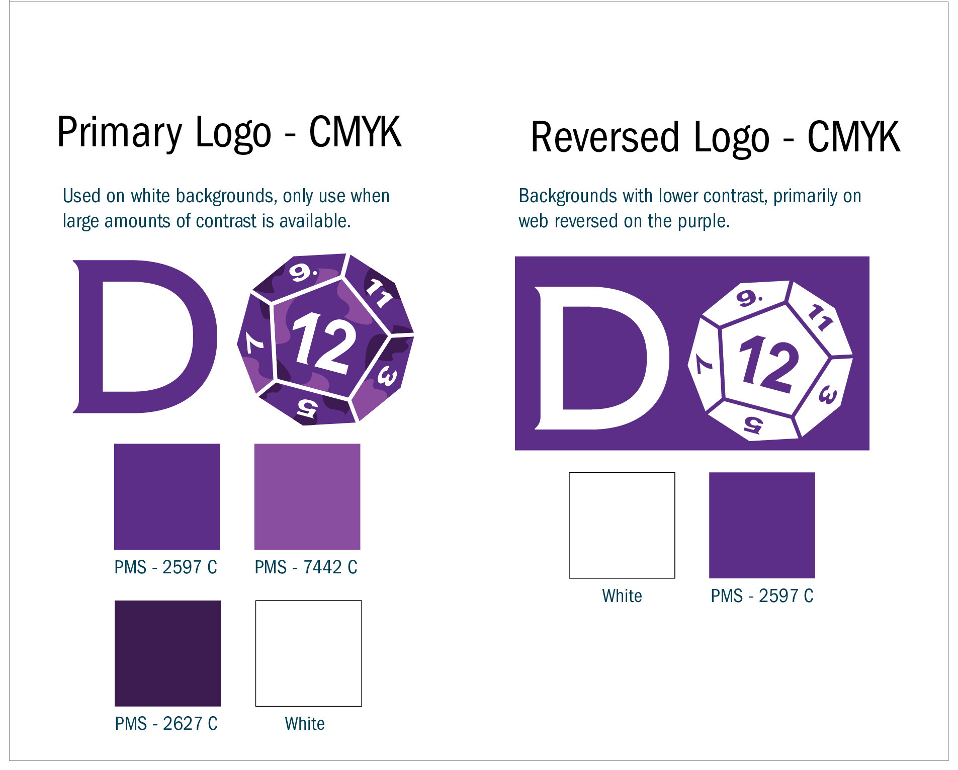
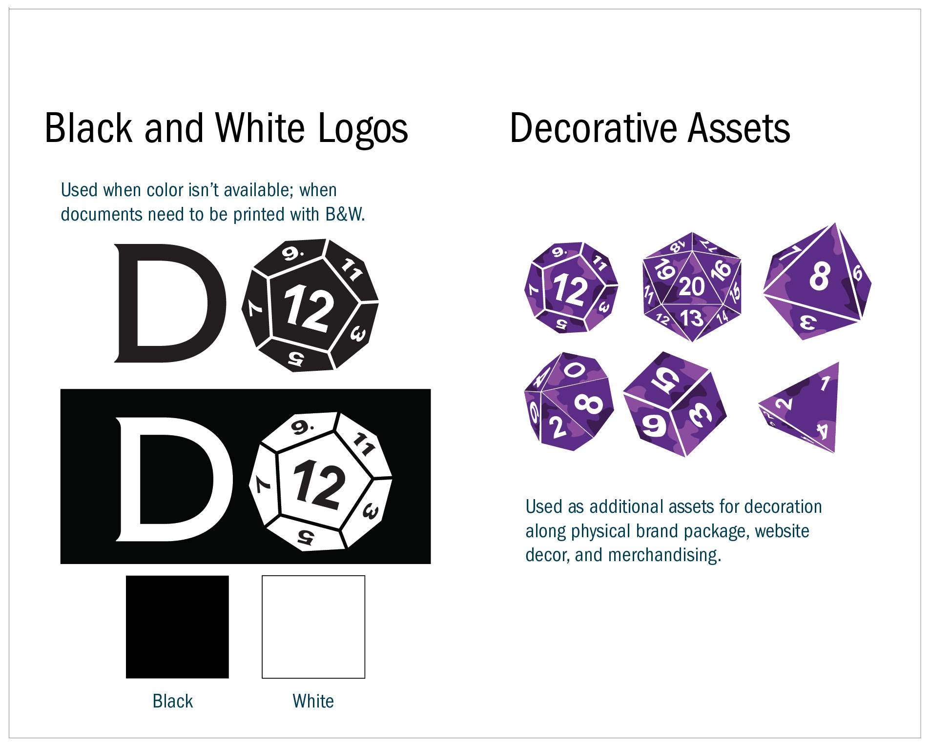
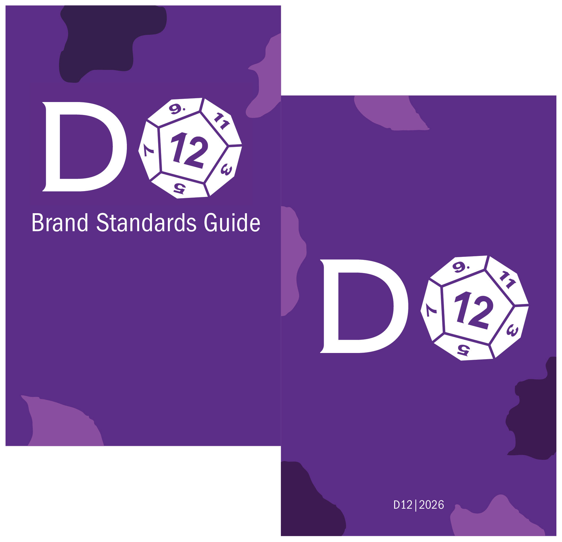
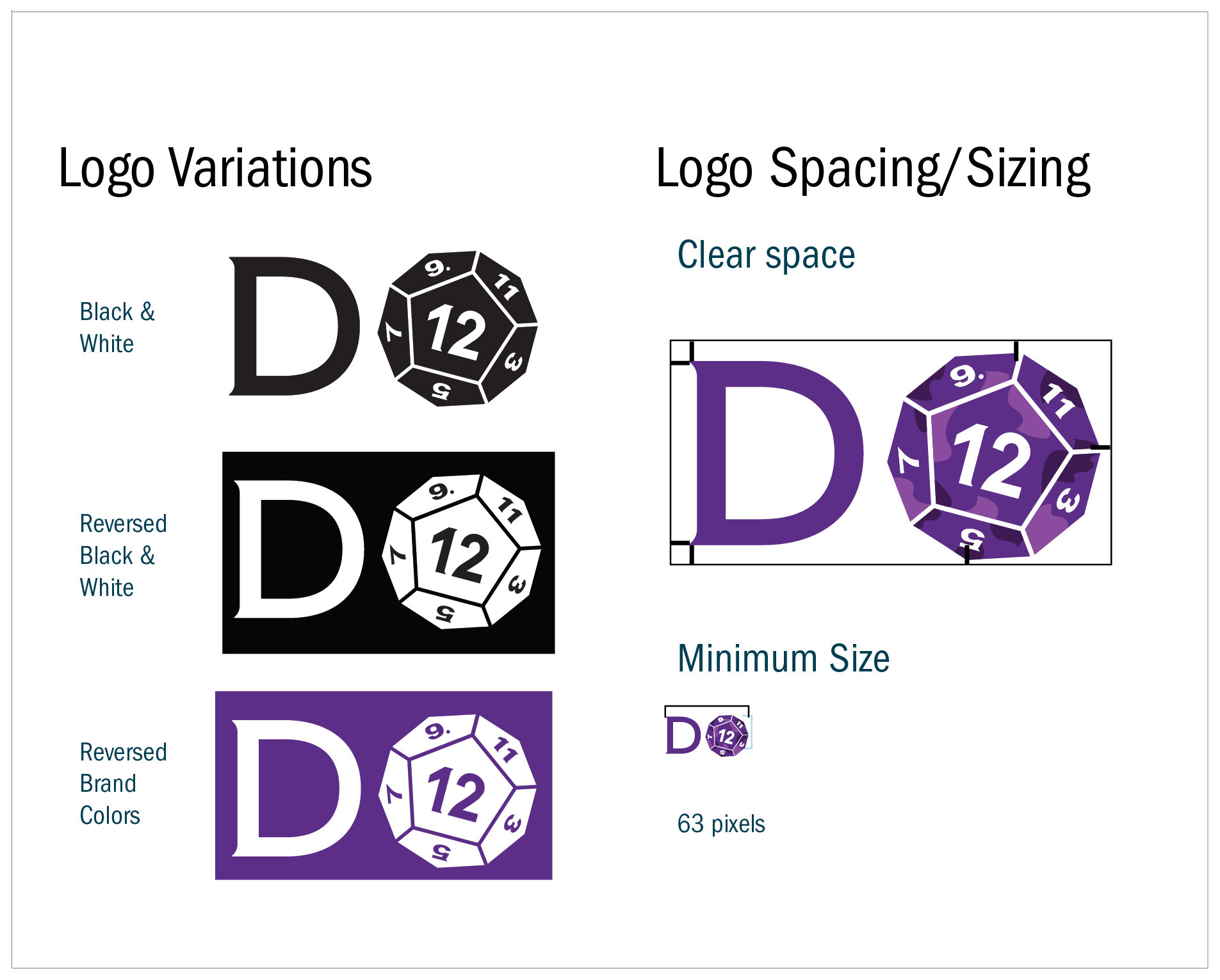
Translating the D12 identity into a brand standards booklet required creating a visually engaging and easy-to-follow design. Utilizing bold colors to direct the viewer’s attention and incorporating organic decorative shapes inspired by the process of mixing dyes into acrylic to create dice. The result is a bold brand meant to catch the attention of TTRPG enthusiasts.
deliverables:
5 x 8in Booklet
Turning the D12 branding into a website required balancing the brand’s bold personality with a clear and easy-to-navigate user experience. Dice assets were used as decorative elements throughout the interface while bold colors framed the main content, creating an engaging experience that draws viewers’ attention to key content and interactive elements.
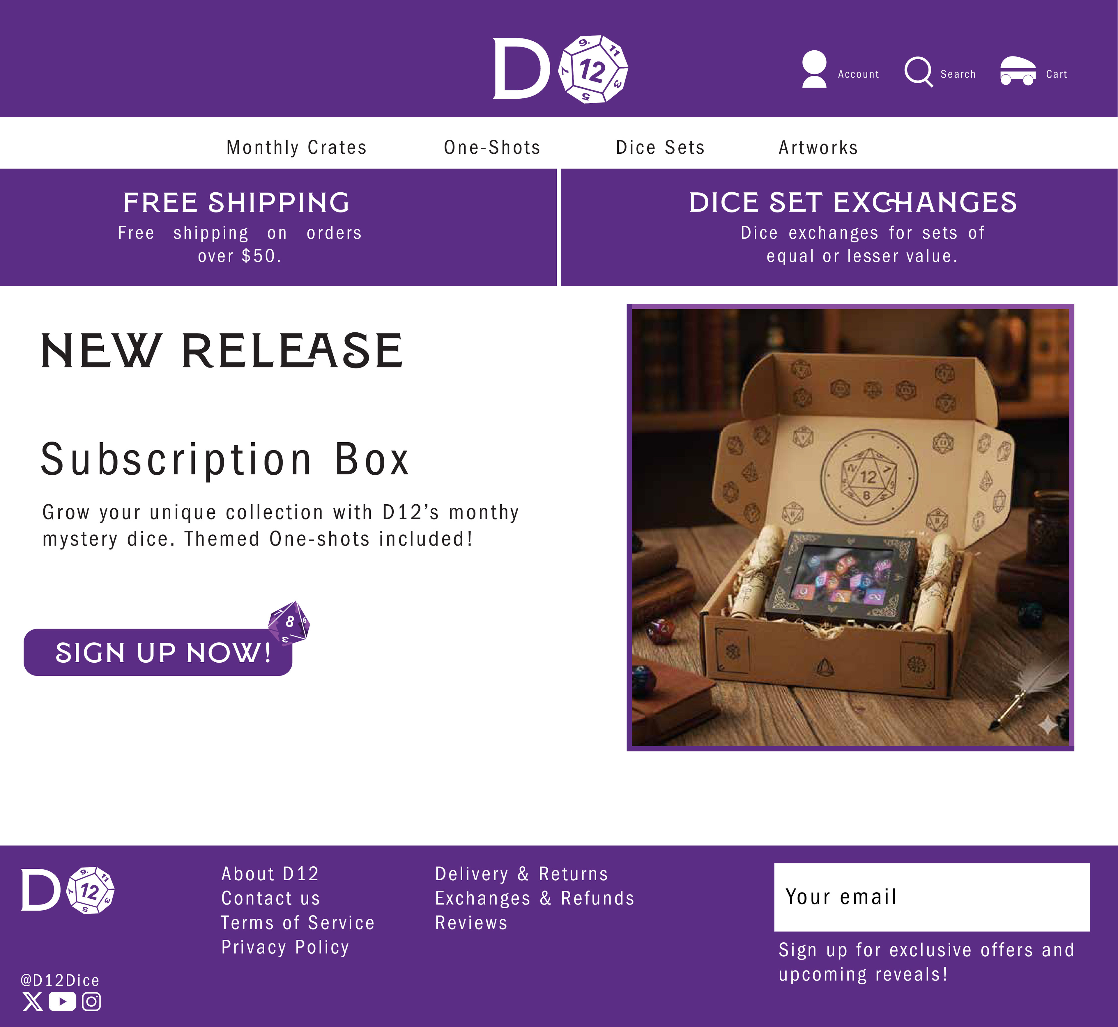
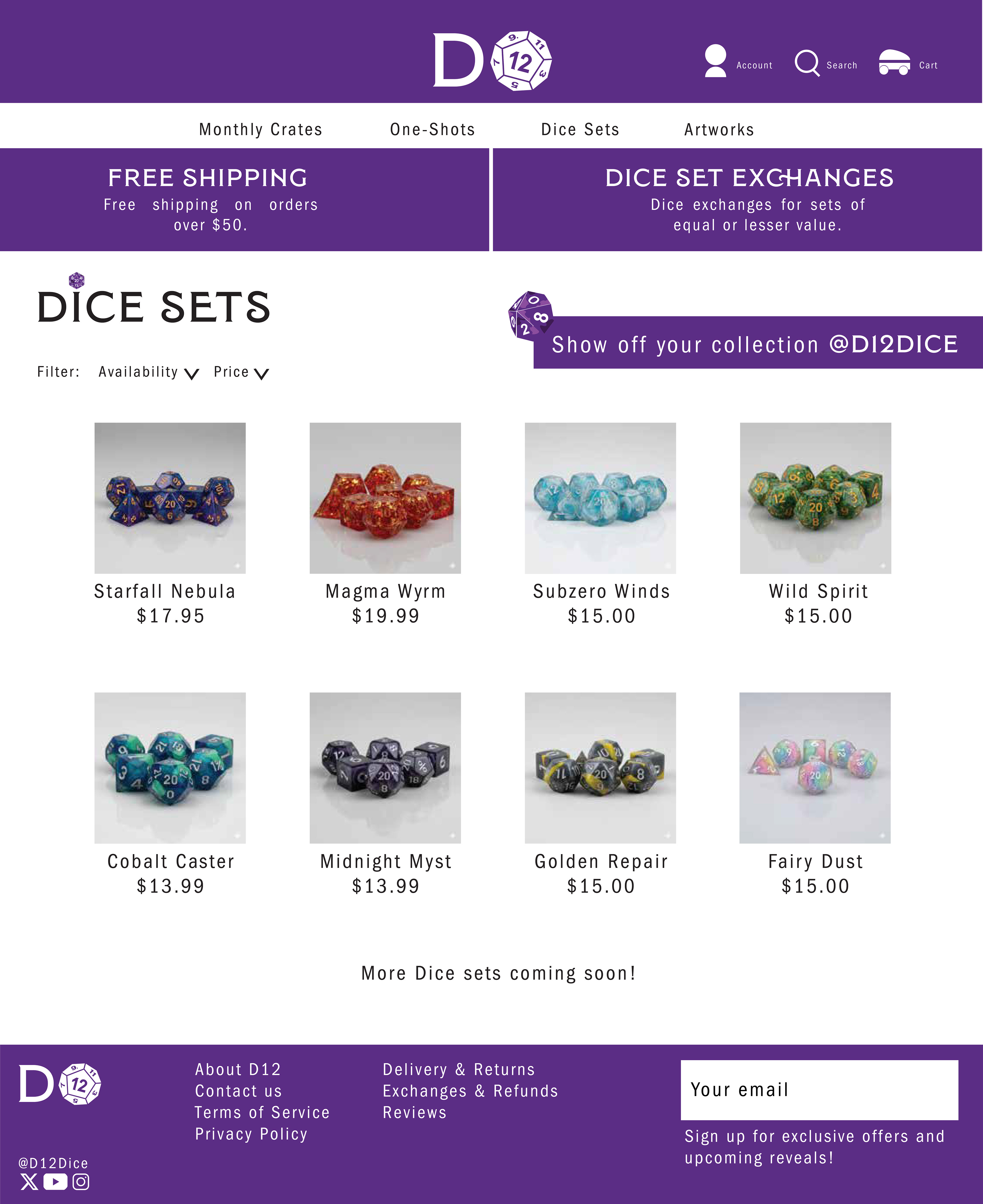
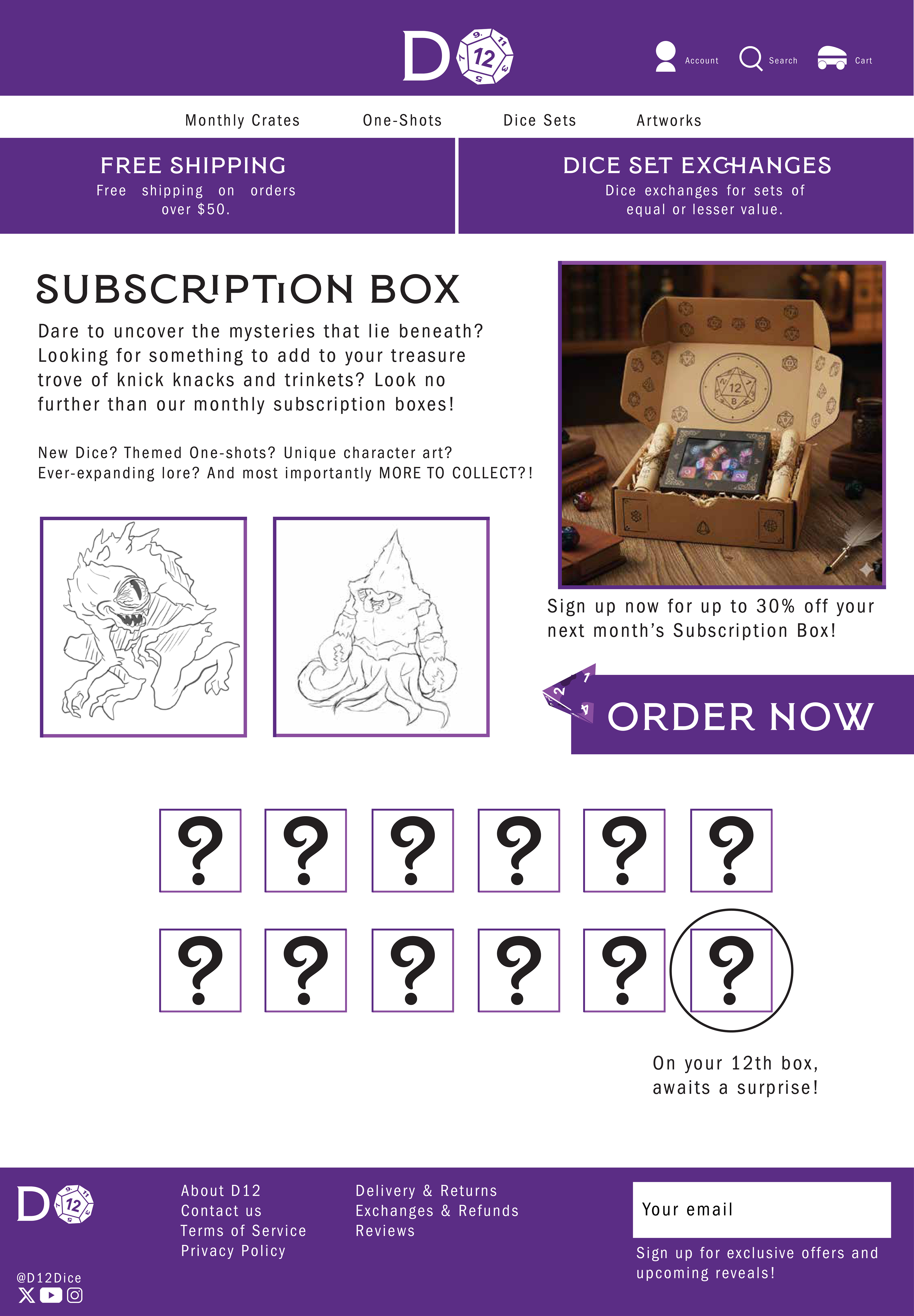
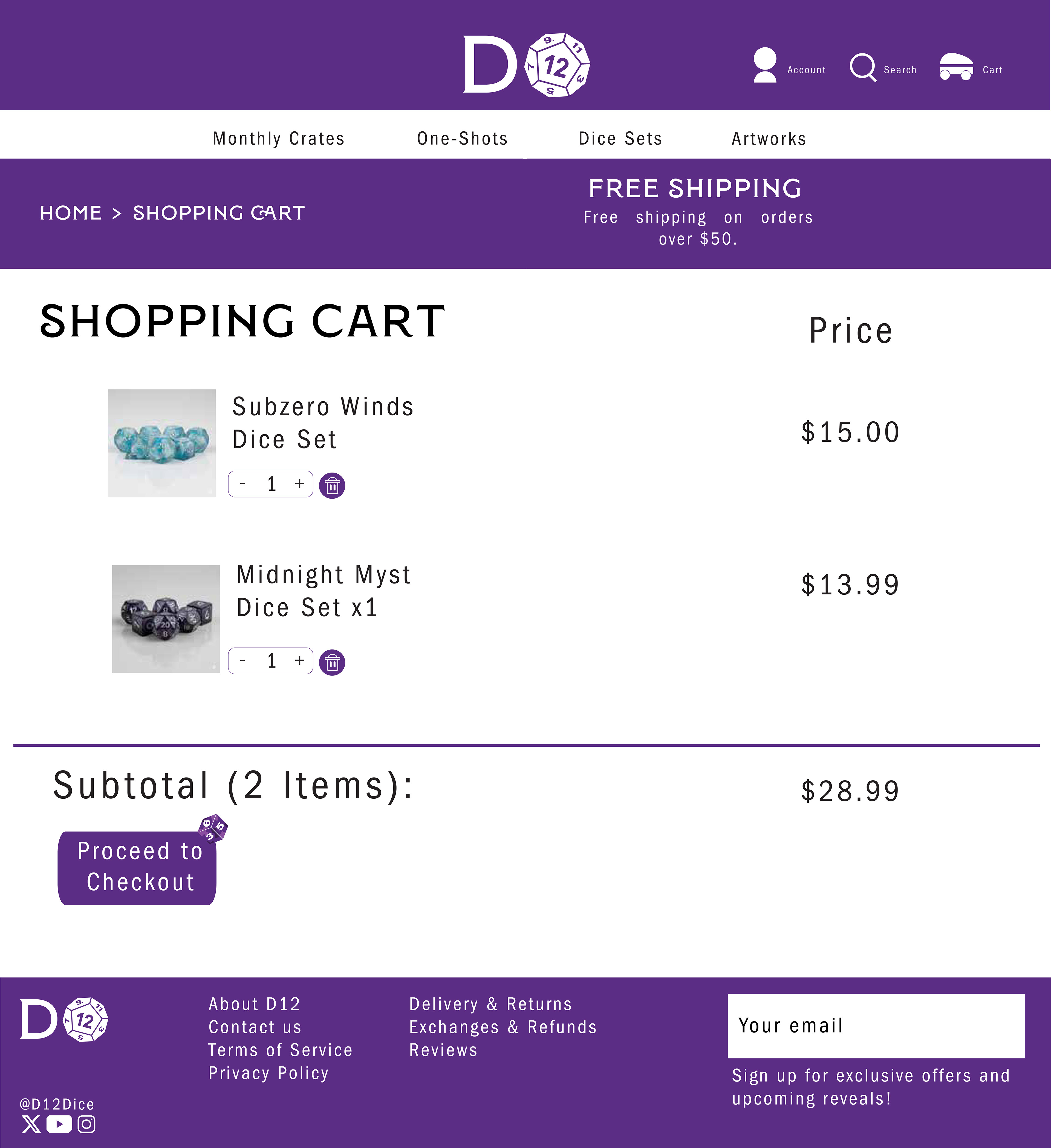
deliverables:
1920 x 1080px Website